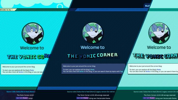
New themes for The Yonic Corner
Now that the interface and most of the features of the blog have been implemented, it was about time I took on adding a feature I’ve been looking forward for a long time: Having a dark theme.
What I thought would be a simple thing turned into an unexpected challenge because of the way this blog was designed. But alas, it’s finally completed, but I also took the time to add even a third theme.
In the settings panel (there’s a gear icon on the lower left of your screen) you can choose between the three:
- Light: This is the original theme that was implemented on the site.
- Dark: A “dark mode” version of the Light theme. It uses blue colors as a basis instead of green.
- Legacy: Based on the Legacy Version of this blog.
By default it is set to Auto, where the blog will automatically choose between the light and dark theme depending on whether you’re using the light or the dark mode in your system. This is also the behavior the blog uses when JavaScript is disabled.
So why did it take so much effort to have it working? From a web developer perspective, I probably shot myself in the foot with the decisions I took for the blog, because I was no longer able to use CSS variables, and had to rely on SCSS for most of the work.
I also did a couple hacks with Astro, such as inlining SCSS as an URL that points to server endpoints that take some time to render. The theme stylesheets ended up becoming globally scoped and a bit hard to handle as a result.
This will surely come to bite me whenever I want to add new features…

At any rate, I really like the new themes. I used the main colors that represent me the most: Green and blue. Since the green was used for the light theme, I went with the darker blue for the dark theme.
As for the Legacy theme, it tries to recreate the overall look of the Legacy blog while maintaining the same UI. Funny enough, I like to use the Legacy theme over the Light one —that’s also why I added it in the first place.
I even recreated the logo animation from the Legacy website for the Legacy theme!
The logo used in this blog.

The logo used in the Legacy Version.

With this, I’m pretty confident to announce that (for now) The Yonic Corner is feature complete! There’s still one new feature I haven’t talked about yet, but it’s become available for quite a while. I don’t want to flood my recent posts with blog updates, so that will wait for some time. You can find it in the lowermost part of the blog!


